← Go back
LOGO design · BRAND IDENTITY · graphic & illustration
Slow Coast is brand identity for an indie rock band from the San Francisco Bay Area, formed in 2022 and known for a sunny, upbeat sound paired with introspective lyrics. The project included a hand lettered logo, a series of geometric album covers, and merch design that carries the story behind the music, giving the band a visual identity as distinct as their sound.

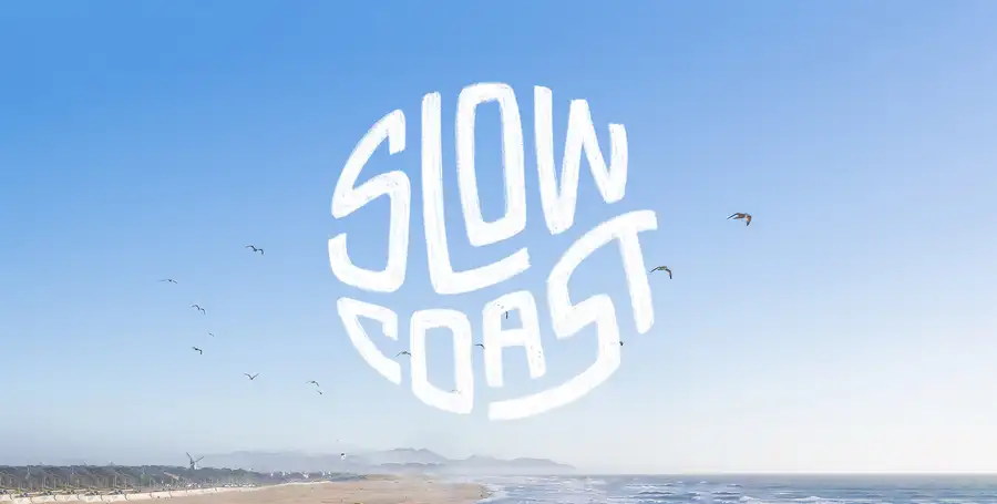
A wordmark drawn by hand, not built on a grid.
The Slow Coast mark started as a brush drawn sketch, kept loose and a little uneven on purpose. It reads like something painted on a wall near the beach, matching a band that sounds sunny on the surface and searching underneath.
The Album
Home of the Restless, pressed to vinyl.
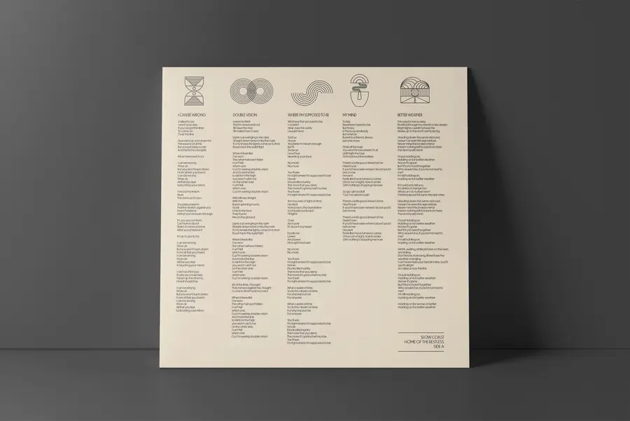
The debut record needed a cover that felt calm from a distance and unsettled up close, so the sleeve pairs a single continuous line with a quiet, restrained palette across the jacket and labels.




The COVERS
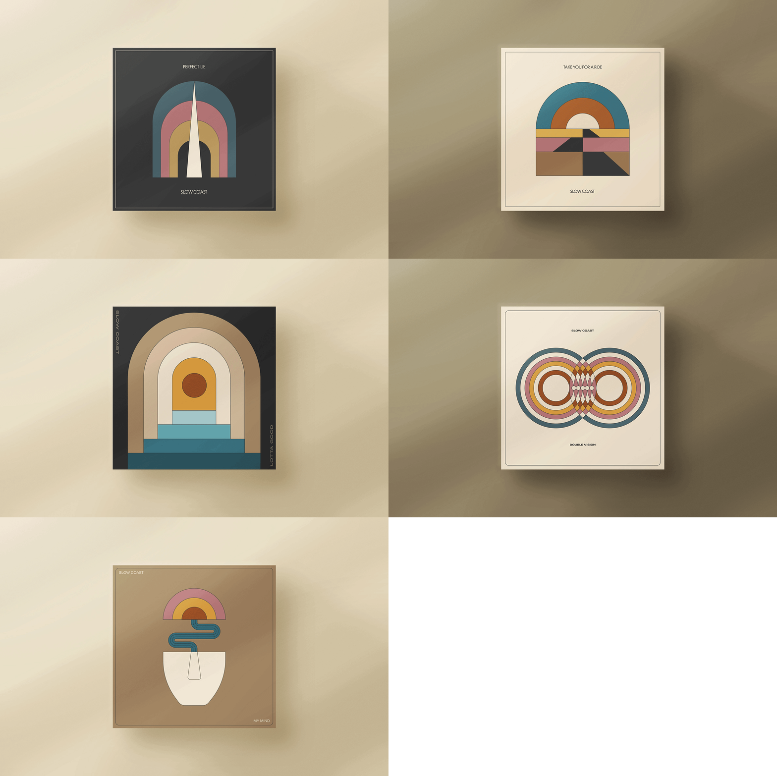
Eleven songs, eleven arts.

Every track on the record got its own geometric mark, pulled from a line in the lyrics and drawn in the same restrained style as the cover, turning the lyric sheet into a small gallery of its own.
Color Palette
Ivory and ink, with one dusty rose accent.
Cream
#F6F2DF
Dusty Rose
#A67979
Paper
#FAF9F7
Ink
#1C1C1C
In Use
From the turntable to the merch table.

See more work →