← Go back
LOGO design · Brand IDENTITY · graphic & illustration
Prickly is a gender neutral shaving cream brand built to break away from highly gendered health and beauty products. Made for people between eighteen and thirty five who want a natural, quality product at a price that makes sense, the brand leans into the unexpected with quirky type, bold colors, and language that welcomes everyone.

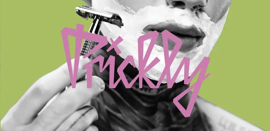
The Logo

A wordmark that looks hand carved, not corporate.
Most shaving products lean on clean, clinical type to feel trustworthy. Prickly does the opposite, pairing a jagged, hand drawn mark with a name that pokes fun at itself, so the brand reads as playful and honest instead of polished and generic.
The Packaging
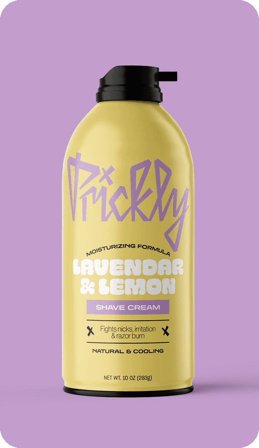
Four scents, four colors, zero rules.
Each can gets its own loud color pairing and a bubbly, oversized scent name, so the lineup feels more like a record collection than a drugstore shelf, built to stand out without picking a side.


Color Palette
Nine bright colors that refuse to pick a side.
Coral
#EC9E85
Teal
#89D2C8
Pink
#EEC9D7
Periwinkle
#9290D2
Gold
#E2D080
Green
#A7C063
Lavender
#C29CCA
Sky
#D0F8FF
Terracotta
#B98669
See more work →