← Go back
brand naming · Logo design · Brand Identity
Copper Coffee Co. is a coffee shop in San Diego, California, built around the personal story of its owner, James Copper. After thirty years as a diver and a lifetime of loving coffee, he wanted a brand that felt like him: warm, elegant, and tied to the ocean he spent his life exploring.

Thirty years underwater, one lifelong love of coffee.
James spent three decades as a diver before opening Copper Coffee Co., and that history shaped every part of the brand. The name, the colors, and the mark all trace back to his years on and under the water, brought together with his other constant companion: a good cup of coffee.
The Symbol


A diving helmet for a shop by the harbor.
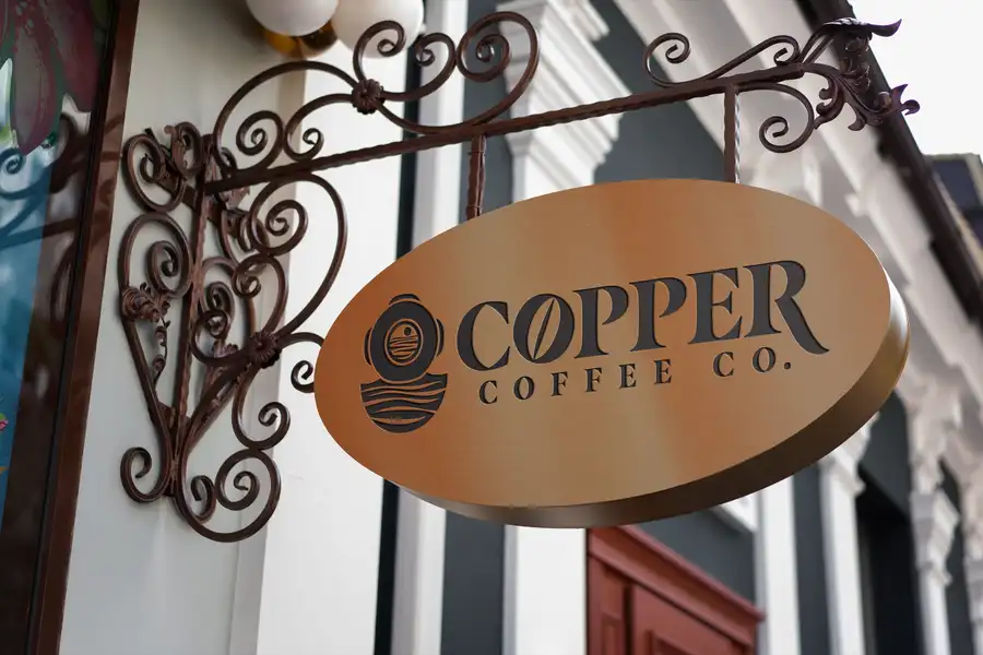
We imagined Copper Coffee Co. sitting at the edge of the water in a small harbor town, so the mark borrows the shape of a vintage diving helmet, its window framing a quiet horizon where the sun meets the sea.
The Logo
A mark built to travel, from signage to ceramics.
The helmet and the wordmark work well together or apart, holding up just as well on a hanging storefront sign as it does printed small on a mug.



Color Palette
Deep navy and warm copper, straight off the coast.
Navy
#0C2A5B
Dark Brown
#2A180C
Cream
#FFF4DF
Copper
#A9732A
In Use
From the roastery to the table.


See more work →